UI Questions & Samples
Change logo at the top left corner
You can replace both full and minimized versions of logo in public/assets/img/brand folder.
If you want to change extension or name of those files, you need to edit the file located at src/containers/DefaultLayout/DefaultHeader.js.
Change menu items on sidebar (left menu)
Change PageInfos json in src/pages.js.
var PageInfos = {
    Dashboard: {
        name: getLocalizedText("DASHBOARD"),
        url: `/dashboard`,
        component: Dashboard,
        resourceCode: 'MainPage',
        icon: 'icon-speedometer',
    },
    Title_Admin: {
        title: true,
        name: getLocalizedText("TITLE_ADMIN"),
    },
    Menu_Admin: {
        name: getLocalizedText("ADMINISTRATION"),
        resourceCode: 'AdminPages',
        icon: 'cui-cog',
        defaultOpen: true
    },
    Company_Mng: {
        name: getLocalizedText("COMPANIES"),
        url: '/company',
        component: Company_Mng,
        parentResourceCode: 'Paes',
        resourceCode: 'oeere_e',
        icon: 'icon-grid',
    },
    Users_Mng: {
        name: getLocalizedText("USERS"),
        url: '/users',
        component: Users_Mng,
        parentResourceCode: 'Paes',
        resourceCode: 'Users',
        icon: 'icon-people',
    },
    Parameters_Mng: {
        name: getLocalizedText("PARAMETERS"),
        url: '/parameters',
        component: Parameters_Mng,
        parentResourceCode: 'mAdminPages',
        resourceCode: 'SystemParameters',
        icon: 'icon-list',
    },
   LivePreview: {
        name: getLocalizedText("LIVE_PREVIEW_LABEL"),
        url: '/livePreview',
        component: LivePreview,
        resourceCode: 'LivePreview_Res',
        icon: 'icon-eye',
        badge: { variant: 'info', text: 'NEW' }
    },
    ...
}
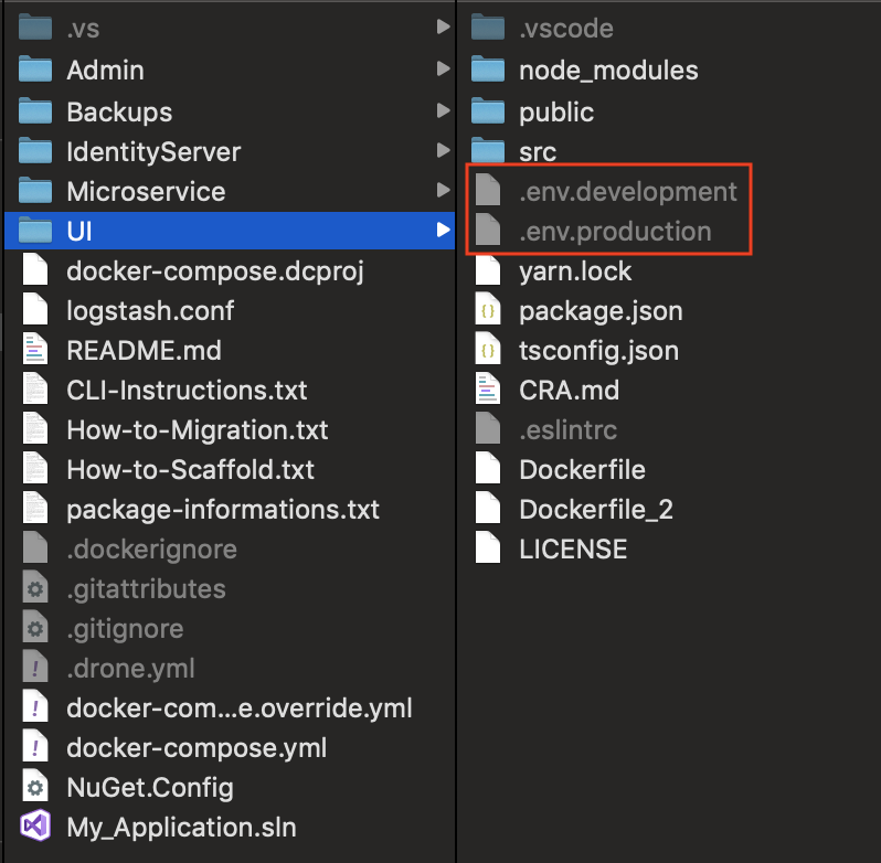
Domains and base URLs for services
Domains and base URLs used for services can be changed from .env.development and .env.production files located root of your UI folder.
Those files could be hidden for macOS and linux based operating systems.
PORT=3000 // UI project's port
REACT_APP_IDENTITY_URL=http://localhost:5000
REACT_APP_ADMIN_URL=http://localhost:5050
REACT_APP_API_URL=http://localhost:5051
REACT_APP_API2_URL=http://localhost:5052
REACT_APP_API3_URL=http://localhost:5053
REACT_APP_KIBANA_URL=http://localhost:5601
REACT_APP_SCHEDULER_URL=http://localhost:5001
Environment variables acquired and used mostly by constants.ts.
export const IdentityURL = process.env.REACT_APP_IDENTITY_URL;
export const AdminURL = process.env.REACT_APP_ADMIN_URL;
export const ApiURL = process.env.REACT_APP_API_URL;
export const ApiURL_2 = process.env.REACT_APP_API2_URL;
export const ApiURL_3 = process.env.REACT_APP_API3_URL;
export const KibanaURL = process.env.REACT_APP_KIBANA_URL;
export const SchedulerURL = process.env.REACT_APP_SCHEDULER_URL;
For further informations about customizing environments check this link.
HTTP methods for API calls
By default, all requests are done as POST calls.
They can be changed separately for each in src/common/configs/RequestConfig.ts
export const DefaultRequestMethods: IDefaultRequestMethods = {
    [Methods.LIST]: HttpMethods.POST, // GET or POST
    [Methods.GET]: HttpMethods.POST, // GET
    [Methods.INSERT]: HttpMethods.POST, // POST
    [Methods.UPDATE]: HttpMethods.POST, // PUT or PATCH
    [Methods.DELETE]: HttpMethods.POST, // DELETE
    [Methods.EXPORT]: HttpMethods.POST,
    [Methods.IMPORT]: HttpMethods.POST,
    [Methods.COMMON]: HttpMethods.POST,
}
Don't forget to change your controller's
HttpMethodattributes according to your changes.
What is the structure of a "page"?
You'll generally be dealing with 4 files for a page in src folder.
pages.js: Manages how your page navigation looks and where on sidebar.views/Routes/YourPageName/YourPageName.js: React component of your page. No need to edit this file except some advanced scenarios.views/Routes/YourPageName/YourPageNamePageConfig.tsx: Page structure specifying title, tabs, resource code, CRUD service urls, buttons and so on.entities/YourPageNamePage.ts: JSON specifying components, groupings, rules, validations and so on.
Check Sample Page and Custom Page for details.
Where are interfaces and enums used in JSON-based pages?
Find them in src/common/typeConfig.ts
How to relate a resource code for permissions?
1) In src/pages.js, set resourceCode for each menu item if permission-check needed.
samplePage: {
    name: getLocalizedText("SAMPLE_TITLE"),
    url: '/samplePage',
    component: SampleModelPageConfig,
    parentResourceCode: 'SomeParent_Resource_Code',
    resourceCode: 'Model_Resource_Code', // Edit this line
    icon: 'icon-puzzle',
}
2) You should set resourceCode property of pageConfig in views/Routes/YourPageName/YourPageNamePageConfig.tsx file in order to match related authorization claims to API calls.
let  pageConfig:  IPageConfig  = {
  headerTitle: getLocalizedText('SEARCH_LIST_TITLE'),
  tabs: [
    {
      title: 'Model Title',
      type: SampleModelType,
      resourceCode: 'Model_Resource_Code', // Edit this line
      ...
    },
    ...
  ]
};
Check Authentication & Authorization for details.
Want to create a listing page without insert, update and delete
Use allowedMethods array property. Each value changes layout accordingly.
let  pageConfig:  IPageConfig  = {
  headerTitle: getLocalizedText('SEARCH_LIST_TITLE'),
  tabs: [
    {
      title: 'Model Title',
      type: ModelType,
      ...
      allowedMethods: [ // Edit this array
        LIST,
        GET,
        // INSERT,
        // UPDATE,
        // DELETE
      ]
    },
  ]
};
TODO: Add an image depicting corresponding buttons
Adding new tab to a page
Go and find your pageConfig file such as src/views/Routes/YourPageName/YourPageNamePageConfig.tsx and add new item to tabs array.
You can check the example page below with two tabs in it.
import { IPageConfig, Methods, pageConfigWrapper } from '../../../../common/typeConfig';
import ResourceDefinitionType from '../../../../entities/Management/ResourceDefinitionType';
import AuthActions from '../../../../entities/Management/AuthActions';
import { getLocalizedText } from '../../../../common/localizationManager';

const { LIST, GET, INSERT, UPDATE, DELETE, EXPORT, IMPORT } = Methods;

var pageConfig: IPageConfig = {
    headerTitle: getLocalizedText('SEARCH_LIST_TITLE'),
    tabs: [
        {
            title: getLocalizedText('RESOURCE_DEFINITION_TITLE'),
            type: ResourceDefinitionType,
            resourceCode: 'ResourceDefinitionInfo_tab',
            editOnModal: false,
            list: {
                url: 'authResources/list',
            },
            get: {
                url: 'authResources/getById',
            },
            insert: {
                url: 'authResources/insert'
            },
            update: {
                url: 'authResources/update',
            },
            delete: {
                url: 'authResources/delete',
            },
            bulkImport: {
                url: 'authResources/bulkSave'
            },
            allowedMethods: [
                LIST,
                GET,
                INSERT,
                UPDATE,
                EXPORT,
                DUPLICATE
            ],
        },
        {
            title: getLocalizedText('RESOURCE_ACTIONS_TITLE'),
            type: AuthActions,
            resourceCode: 'AuthActionsInfo_tab',
            editOnModal: true,
            collapseOnEdit: true,
            list: {
                url: 'authActions/list',
            },
            get: {
                url: 'authActions/getById',
            },
            insert: {
                url: 'authActions/insert'
            },
            update: {
                url: 'authActions/update',
            },
            delete: {
                url: 'authActions/delete',
            },
            bulkImport: {
                url: 'authActions/bulkSave'
            },
            allowedMethods: [
                LIST,
                GET,
                INSERT,
                UPDATE,
                DELETE
            ],
        },
    ],
    customEvents: (resourceDefinition, authActions) => [
        [[resourceDefinition.resourceId, "originalValue"], [[authActions.resourceId, "value"]]],
    ],
};

export default pageConfigWrapper(pageConfig);
Be aware of that with
customEventsfunction property, we've formed a primary key-foreign key relation btw tabs. To complete it, check Setting Parent-Child relation btw tabs
| Model | Hierarchy | Key |
|---|---|---|
| resourceDefinition | Parent | resourceDefinition.resourceId |
| authActions | Child | authActions.resourceId |
Set Parent-Child relation between tabs
Addition to the previous example, we need to set child model's foreign key's visibility property as shown below.
(In this case, resourceId is the foreign key)
import { IType, ComponentType, Visibility } from '../../common/typeConfig';
import { getLocalizedText } from '../../common/localizationManager';

const { TABLE, FORM, FILTER, BG_FILTER, BG_FORM, FK_FILTER, FK_FORM } = Visibility;

let type: IType = {
    actionId: {
        isPrimaryId: true,
        typeKey: 'action'
    },
    resourceId: { // foreign key
        label: getLocalizedText('RESOURCE_CODE_LABEL'),
        visibility: [BG_FORM, FK_FILTER] // You should at least add these two for foreign key of child model
    },
    ...
}

export default type;
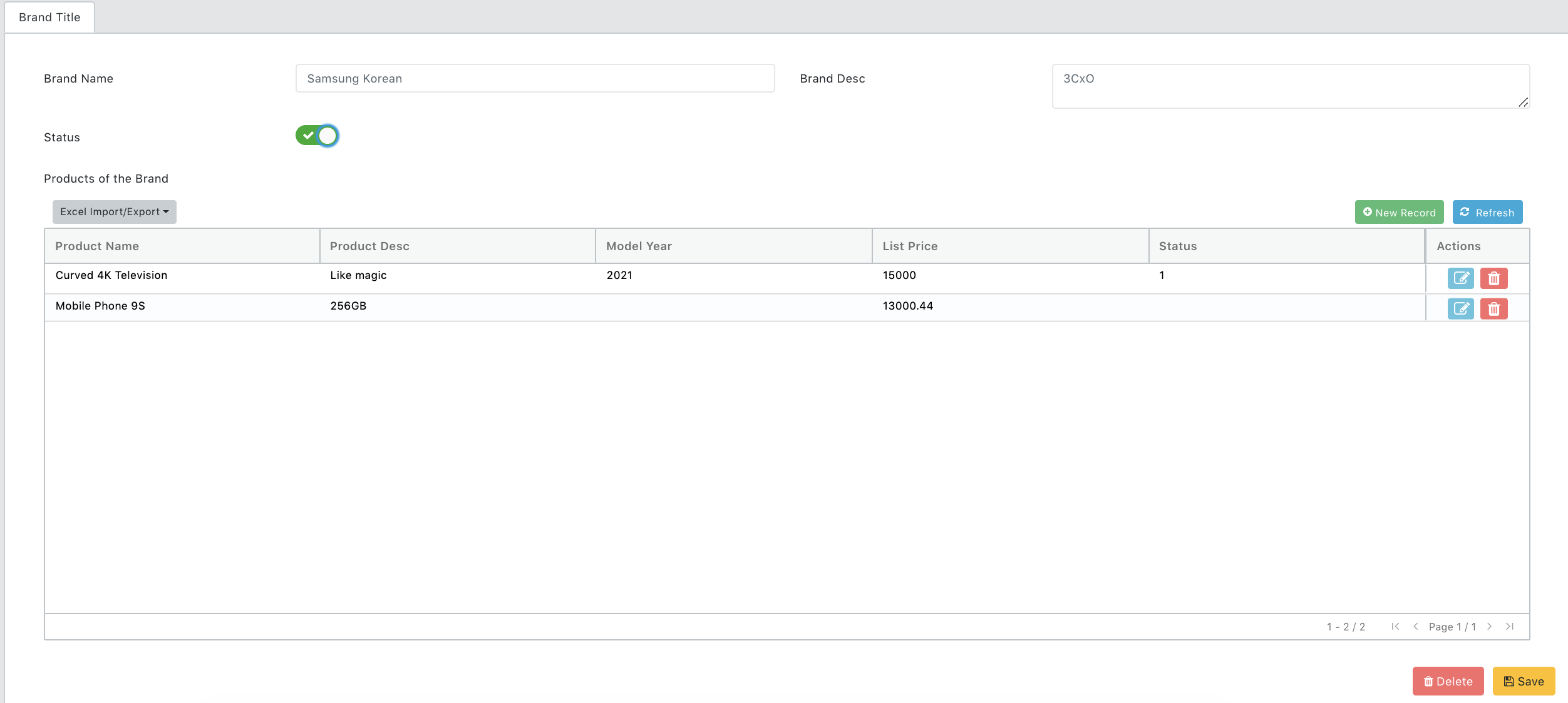
Set Master-Detail (Parent-Child) relation in the same page
Addition to the previous example, there is another option to set parent-child structure in the same page. Let's assume brand is the master/parent and the product is the child/detail.
This is how it should look like.
  ...
  products: {
    label: "Products of the Brand",
    typeInd: ComponentType.TABLE,
    labelProps: { position: LabelPositions.ABOVE_INPUT},
    visibility: [FORM],
    columnSize: { all: 12 },
    tableConfig: {
      referredPageConfig: ProductPageConfig,
      referredTabIndex: 0, // if more than one tab exists in the ProductPageConfig
      customEvents: (brand, product) => [
        [[brand.brandId, "originalValue"], [[product.brandId, "value"]]],
      ],
      hideFilters: true,
      hideRefreshButton: false,
      refreshButtonProps: {
        refreshButtonText: "Refresh (test)", // optional
        style: { color: 'red' }
      }
    },
  },
  ...
  ...
  brandId: {
    label: "Brand Id",
    typeInd: ComponentType.NUMERIC_INPUT,
    visibility: [BG_FORM, FK_FILTER] // important property
  }
  ...
This is how it looks simply:
What is the "visibility" property of a component means?
Options starting with BG_ and FK_ should be understood well.
| Value | Description |
|---|---|
| FORM | Show in Insert/update mode |
| FILTER | Show in Filter/criteria part for searching |
| TABLE | Show in table as column |
| BG_FORM | Set in insert/update mode in Background like hidden value. It is always posted to insert/update url. |
| BG_FILTER | Set as default hidden filter value in Background . It is always posted as one of filters for listing. |
| FK_FORM | Foreign key in insert/update mode |
| FK_FILTER | Foreign key in search like hidden value. It is always posted as one of filter for listing. |
Set custom error message to a component validation
Option 1: Use can use customErrMsg property of valRules to override default invalid pattern message.
Option 2: Or you can write a simple function as customValidator to customize any messages for each of your conditions.
Additional Example
...
email: {
  label: getLocalizedText("EMAIL_LABEL"),
  typeInd: ComponentType.FORM_CONTROL,
  visibility: [FORM],
  valRules: { // Option 1
    regex: Regexes.email,
    customErrMsg: 'This is a customized error message'
  },
},
password: {
  label: getLocalizedText('PASSWORD_CONFIRM_LABEL'),
  visibility: [FORM],
  valRules: { // Option 2
    customValidator: (typeElement, type, showValidations) => {
        if (showValidations)
          if (type.passwordConfirm.value != typeElement.value)
            return getLocalizedText('PASSWORDS_SHOULD_MATCH')
        return "";
    }
  },
},
...
Radio button sample
Use customProps property of a field which component type is RADIO_BUTTON.
commDefinitionType: {
    label: "Comm Definition",
    typeInd: ComponentType.RADIO_BUTTON,
    visibility: [FORM, TABLE],
    columnSize: { all: 6 },
    valRules: { minLength: 1 },
    defaultValue: 1,
    customProps: {
        options: [
            {
                label: getLocalizedText('EMAIL_TITLE'),
                value: 1
            },
            {
                label: getLocalizedText('SMS_TITLE'),
                value: 2
            }
        ]
  }
}
Custom validation rule and corresponding warning message
Use customValidator function property of valRules.
tenantId: {
    label: getLocalizedText('TENANT_ID_LABEL'),
    isPrimaryId: true,
    ...
},
parentTenantId: {
    ...
    valRules: {
        customValidator: (typeElement, type, showValidations) => { // This part is what you need
            if (showValidations && type && type.tenantId && type.tenantId.value > 0 && type.tenantId.value == typeElement.value)
                return getLocalizedText("PARENT_TENANT_CAN_NOT_BE_SAME");
            return "";
        }
    }
}
Format/mask a value according to a pattern
Use maskPattern property.
creditCardNo: {
    label: "Credit Card",
    typeInd: ComponentType.FORM_CONTROL,
    visibility: [FORM],
    maskPattern: "9999-9999-9999-9999", // For 16-digit cards
    valRules: {
      minLength: 13, // Visa and loyalty cards may have 13-digit
      maxLength: 19, // Visa: 4024007101013125732
      acceptEmptyStrings: true // let it be empty, but if not empty check the valRules
    }
}
if you want to mask/format it in Table, add tableDataFormatter property.
import VMasker from 'vanilla-masker'; // Don't forget to import the Vanilla Masker in this case
...
creditCardNo: {
    label: "Credit Card",
    typeInd: ComponentType.FORM_CONTROL,
    visibility: [FORM, TABLE], // Add as column to Table
    maskPattern: "9999-9999-9999-9999", // For 16-digit cards
    valRules: {
      minLength: 13, // Visa and loyalty cards may have 13-digit
      maxLength: 19, // Visa: 4024007101013125732
      acceptEmptyStrings: true // let it be empty, but if not empty check the valRules
    },
  tableDataFormatter: (cellVal, row) => { return VMasker.toPattern(cellVal, "9999-9999-9999-9999") } // This line should be added to format the value in Table
}
Check vanilla-masker for details.
Limit file/mime types to be uploaded
Use accept property of customProps for FILE_UPLOADER and UPLOAD_CONTAINER components.
onlyPDF: {
    label: "Allow only PDF files",
    typeInd: ComponentType.UPLOAD_CONTAINER,
    customProps: {
      accept: 'application/pdf'
    },
    visibility: [FORM]
},
allImages: {
    label: "Allow all image files",
    typeInd: ComponentType.FILE_UPLOADER,
    customProps: {
      accept: 'image/*'
    },
    visibility: [FORM]
},
allImagesAndPDF: {
    label: "Allow all image and PDF files",
    typeInd: ComponentType.FILE_UPLOADER,
    customProps: {
      accept: 'image/*, application/pdf'
    },
    visibility: [FORM]
},
differentMimeTypes: {
    label: "Different Mime Types",
    typeInd: ComponentType.FILE_UPLOADER,
    customProps: {
      accept: 'image/*, .pdf, .xls, .xlsx, .doc, .docx, .txt'
    },
    visibility: [FORM]
}
Change FILE_UPLOADER's posted data
By default, posted data for upload components is a json as:
{
    "file": "iVBORw0KGgoAAAANSUhEUgAAAvQAAAISCAYAAACjwVuJAAAgAElEQVR4AeydB5wURfbHf70zG4jiAgossCxZghIERVhJBlDgwHAG1EPgCHreX4mCIlFFghhJCnIIKueJqCgiSthFgpJUctolr2Qkbpr....",
    "fileName":"someImageName.png",
    "mimeType":"image/png"
}
You can change customProps's mode to base64.
profilePicture: {
    label: "Profile Picture",
    typeInd: ComponentType.FILE_UPLOADER,
    customProps: {
      mode: 'base64' // send file's content as base64 instead of json
    },
    visibility: [FORM]
},
Check also How to manage FILE_UPLOADER's JSON data
Fill dropdown’s options asynchronously when typing
You should post Criteria to filter.
companyId: {
    label: "Company",
    typeInd: ComponentType.DROPDOWN_ASYNC,
    visibility: [FORM],
    optionConfig: {
      listUrl: `${Constants.AdminURL}/coreCompany/list`,
      getValue: (item) => '@{companyId}',
      getLabel: (item) => '@{companyName}',
      filterBy: (type, inputText) => ({
        Criteria:
        {
          companyId: type.companyId.value || 0, // this is used to set if there is already chosen
          companyName: inputText // this is the "where" condition
        },
      }),
    },
}
Format values such as date in Table
Use tableDataFormatter function property.
workStartTime: {
    label: getLocalizedText('WORK_START_DATE'),
    typeInd: ComponentType.DATE_PICKER,
    visibility: [FORM, TABLE],
    group: group2,
    tableDataFormatter: TableFormatters.defaultDateFormatter // find in 'src/common/common.js'
},
status: {
    label: getLocalizedText('STATUS_LABEL'),
    typeInd: ComponentType.DROPDOWN,
    visibility: [TABLE, FILTER, FORM],
    optionConfig: {
        ...ParameterOptionTemplate,
        filterBy: (type, inputText) => ({
            keyCode: 'LOG_STATUS'
        }),
    },
    defaultValue: 3,
    tableDataFormatter: TableFormatters.parameterFormatter("LOG_STATUS") // matches the "keyCode" + and corresponding current "value" from cache and works multi-lingually
},
Override the buttons (edit-delete) on the right handside of each row in Table/Grid
Use tableActionColumnRenderer function property of customRenderers in YourModelPageConfig.tsx.
import React from 'react';
import ActionRenderer from '../../../components/ActionRenderer';
import Button from '../../../components/Button';
.....

var pageConfig: IPageConfig = {
  headerTitle: getLocalizedText('SEARCH_LIST_TITLE'),
  tabs: [
    {
      title: 'Page Title',
      type: About,
      resourceCode: 'Some_Resource_Code',
      editOnModal: false,
      customRenderers:{
        tableActionColumnRenderer: (tableProps, row) => {
          return <>
            <ActionRenderer {...tableProps} row={row} /> {/* Standard Edit and Delete buttons of Table */}
            <a href="#" style={{ height: 30 }} onClick={(e) => {
                e.stopPropagation();
                alert("Button pressed")
                }} >
                  <i style={{ color: '#228B22', fontSize: 19 }} className="fa fa-phone fa-lg" />
            </a >
          </>
        }
      },
      list: {
        url: `${Constants.ApiURL}/someApiService/list`
      },
      get: {
        url: `${Constants.ApiURL}/someApiService/getById`
      },
      insert: {
        url: `${Constants.ApiURL}/someApiService/insert`
      },
      update: {
        url: `${Constants.ApiURL}/someApiService/update`
      },
      delete: {
        url: `${Constants.ApiURL}/someApiService/delete`
      },
      allowedMethods: [
        LIST,
        GET,
        INSERT,
        UPDATE,
        DELETE,
        DUPLICATE
     ],
    },
  ],
}
Does Table/Grid have lazy-loading feature?
Yes, by default 100 records (configurable) are fetched. When the end of it reached, automatically next 100 are fetched from server.
How do Table/Grid's built-in search, filter and ordering/sorting functions work?
Whenever a change done, related service is called instantly to fetch relevant data set.
Use of columnSize in IGroup
vatRate: {
  typeInd: ComponentType.FORM_CONTROL,
  defaultValue: getLocalizedText('VAT_RATE_LABEL'),
  labelPosition: LabelPositions.ABOVE_INPUT,
  visibility: [FORM],
  columnSize: { all:6, group: { all: 3 } }, // 3 of 12
  group: someGroup
}

Need to change/serialize some data when exporting to excel
docDate: {
  label: 'Document Date',
  typeInd: ComponentType.DATE_PICKER,
  excelLabel: 'Change Column Label in Excel if Needed',
  excelOrder: 1,
  exportSerializer: (typeElement, value) => {
    if (value == null || value === "" || value == '0001-01-01T00:00:00')
      return "";

    return moment((value as Date)).format('DD/MM/YYYY');
  },
}
Limit/set max file size of FILE_UPLOADER or UPLOAD_CONTAINER
documentFile: {
  label: 'Document',
  typeInd: ComponentType.FILE_UPLOADER,
  visibility: [FORM],
  customProps: {
    maxFileSize: 2048, // default is 10240 KB
    accept: '.pdf, .xls, .xlsx, .jpg, .png, .doc, .docx'
  }
}
File Uploader can be styled with 'customProps' in order to set sizes
categoryDesc: {
  label: "Category Desc",
  typeInd: ComponentType.FILE_UPLOADER,
  visibility: [FORM, TABLE, FILTER],
  labelProps: {
    position: LabelPositions.ABOVE_INPUT,
    style: {
      fontSize: 45,
      fontWeight: 'bolder',
      textAlign: 'center'
    }
  },
  customProps: {
    style: { height: 80 },
    imageStyle: { height: 50 }
  }
}
Label can be styled with 'labelProps' in order to set its style
labelProps property has been added to manage Component's label properties (ITypeElement -> labelProps)
labelProps: {
  style: {
    color: 'red',
    fontWeight: 'bolder',
    textAlign: 'right'
  }
},
Customizing Components for FILTER
Now you can manage separately validation rules and default values of the Component's FORM and FILTER modes
valRules: {
  minLength: 1,
  maxLength: 150
},
filterValRules: {
  minLength: 3,
  maxLength: 5
}
defaultValue: 'form value',
filterProps: {
  defaultValue: 'filter value'
}
Set custom properties to PROGRESS_BAR
downloadBar: {
  label: 'Download Bar',
  typeInd: ComponentType.PROGRESS_BAR,
  visibility: [FORM],
  customProps: {
    progressBarProps:[
      {
        striped: true,
        animated: true,
        color: 'danger'
      },
    ]
  }
}